
Reading a stock chart like a professional isn’t about memorizing patterns or chasing hype—it’s about understanding what the price is telling you. Whether you’re a beginner or an experienced trader, mastering stock chart analysis gives you a powerful edge in making informed investment decisions. This guide breaks down the essential elements of stock charts, from candlesticks to volume, so you can interpret market movements with confidence and precision.
Why Stock Chart Analysis Matters
Stock charts are more than just lines on a screen—they reflect real-time supply and demand, investor sentiment, and market psychology. Professionals use them to identify trends, spot entry and exit points, and manage risk. Without chart reading skills, you’re essentially investing blind. By learning how to read a stock chart like a professional, you gain insight into price behavior, momentum, and potential reversals before they become obvious to the crowd.
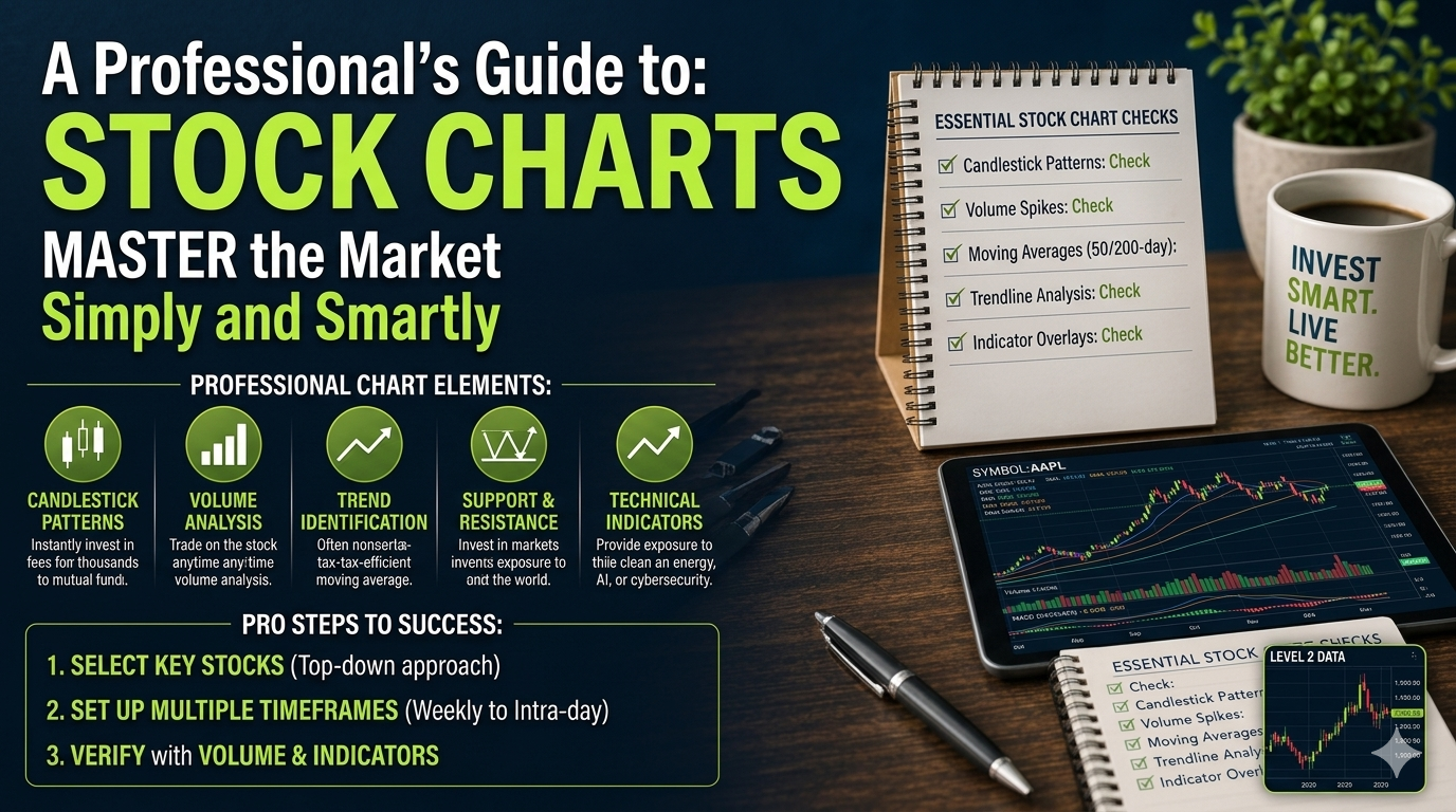
Key Components of a Stock Chart
Every stock chart contains several core elements. Understanding each one is crucial for accurate interpretation:
- Price Axis (Y-axis): Shows the stock’s price levels over time.
- Time Axis (X-axis): Represents the timeframe—daily, weekly, or intraday.
- Candlesticks or Bars: Display open, high, low, and close prices for each period.
- Volume: Indicates how many shares were traded during a given period.
- Trendlines and Support/Resistance: Help identify key price levels and directional bias.
Decoding Candlestick Patterns
Candlesticks are the backbone of technical analysis. Each candle reveals the battle between buyers and sellers. A green (or white) candle means the closing price was higher than the opening price—bullish sentiment. A red (or black) candle signals the opposite—bearish pressure.
Professionals watch for specific candlestick formations like:
- Doji: Indicates indecision; often a reversal signal.
- Hammer: Suggests a potential bullish reversal after a downtrend.
- Engulfing Patterns: Show strong shifts in momentum—bullish or bearish.
These patterns gain significance when they appear near support or resistance levels or align with volume spikes.
Understanding Volume and Its Role
Volume confirms price action. High volume during a breakout suggests strong conviction, while low volume breakouts may be false signals. Professionals look for volume surges to validate trends or spot accumulation/distribution phases.
For example, if a stock breaks above resistance on high volume, it’s a stronger buy signal than the same move on thin volume. Volume also helps identify potential reversals—declining volume during a rally may signal weakening momentum.
Spotting Trends with Moving Averages
Moving averages smooth out price data to reveal the underlying trend. The two most commonly used are:
- Simple Moving Average (SMA): Average price over a set period (e.g., 50-day or 200-day).
- Exponential Moving Average (EMA): Gives more weight to recent prices, reacting faster to changes.
When the short-term EMA crosses above the long-term SMA, it’s a bullish signal (golden cross). The opposite (death cross) suggests bearish momentum. Professionals use these crossovers to time entries and exits.
Support and Resistance: The Psychological Battlefield
Support is a price level where buying interest is strong enough to prevent further decline. Resistance is where selling pressure halts upward movement. These levels aren’t fixed—they shift as market psychology evolves.
Professionals draw trendlines connecting swing highs and lows to identify dynamic support and resistance. A breakout above resistance with volume often triggers new buying, while a breakdown below support can accelerate selling.
Using Technical Indicators Wisely
Indicators like RSI (Relative Strength Index), MACD (Moving Average Convergence Divergence), and Bollinger Bands add depth to chart analysis. However, professionals avoid overloading charts—too many indicators create noise.
For example, RSI above 70 suggests overbought conditions (potential pullback), while below 30 indicates oversold (possible bounce). MACD crossovers signal momentum shifts. Use these tools to confirm, not replace, price action.
Timeframes: Matching Your Strategy
Different timeframes serve different purposes. Day traders focus on 1-minute to 1-hour charts for quick entries. Swing traders use daily or 4-hour charts to capture multi-day moves. Long-term investors analyze weekly or monthly charts for broader trends.
Professionals often use multiple timeframes: a higher timeframe for direction and a lower one for precise entry. This multi-timeframe approach reduces false signals and improves timing.
Key Takeaways
- Reading a stock chart like a professional starts with understanding candlesticks, volume, and trendlines.
- Price action is king—indicators should support, not dominate, your analysis.
- Volume validates breakouts and reversals; ignore it at your peril.
- Use moving averages and technical indicators to confirm trends, not predict them.
- Always analyze charts across multiple timeframes for better context.
FAQ
What is the best timeframe for beginners to read stock charts?
Beginners should start with daily charts. They offer a balanced view of price action without the noise of intraday fluctuations, making trends and key levels easier to identify.
Can you rely solely on stock charts for investing decisions?
While charts are powerful, professionals combine technical analysis with fundamental research. Earnings, news, and macroeconomic factors also influence stock prices.
How do I know if a breakout is real or fake?
Look for confirmation: high volume, sustained price movement beyond the breakout level, and follow-through in subsequent candles. Fake breakouts often reverse quickly with low volume.